Excerpts from Journal Notes, 1972
 |
 |
 |
Sketches of 17R (see below)
Excerpts from Journal Notes, 1972
Excerpts from Journal Notes, 1972
|
|
|
Sketches of 17R (see below)
I've moved into the realm of what I call 'impersonal' color. 'Objective' is probably more fitting than 'impersonal'. But 'objective" is so often juxtaposed with that term 'subjective'-an abhorrent dichotomy that runs headlong into psychological bottlenecks. Probably impossible to preclude that kind of association; if anything the general tendency is to elevate it. Though at best, at least here, it's merely incidental. Perhaps 'nonpersonal' color would be better. That suggests general rather than specific color. To me, Giotto's color was 'nonpersonal' (at the Arena Chapel and Santa Coce). Really no taste canon. Dry, matter-of-fact, but not local.
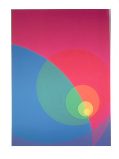
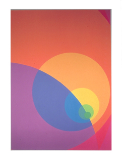
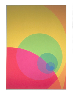
I'm continuing to work in projections and expansions. It seems I can no longer do this by intuition, by rational thought or by analysis. Have to see it all. Trial and error is no longer good enough. Apparently there are no shortcuts. To see this, they must be realized, executed. This has become evident to me through a series of color sketches, #1540. Circular projections and expansions in the round. I thought I'd covered maximum variability only to find when I worked to a larger surface I'd omitted at least 50% of potential. Seems there's no end to this vein. In this, I'm probably akin to Albers, though his speculations are too thin for me.
I used 7 hues in #1540, going from a small pale greenish/yellow to yellow, yellow/orange, orange/yellow, orange, red/orange then to red-dark, large. Working from light to dark, the bending slightly bunched together and spreading out with larger steps. In other words acceleration toward the periphery. Still using fluorescent pigments, their strength is still significant to me. I'd hoped for relative equal intensity. No such luck. The orange/yellow is weak and I had to introduce white to raise its value. Too close to the orange, otherwise. Also too red, I had to add yellow. Wherever these pigments are not close enough hue-wise they break too far in intermixing and diminish intensity. Normally, compared to conventional pigments, this orange/yellow would really be high. Here it almost acts like a warm yellow ochre. Spatially, it takes away from the across surface motion. Of course, this is less than desirable, penetrating when least desirable. Still operative though. The painting forces the viewer out of a preconceived path by acting nearly as an eccentric top. I seem to be working on the very act of perceiving. I simply must learn to understand pigment limitations and avoid them. Can't bunch together on the warm yellows.
Here's another observation that I can't as yet explain. The first five hues, from the greenish/yellow through orange, seem to make a more 'complete?!' color statement than do the seven. This is hard to see now. Eye accommodation? Are certain laws operational? Limitations in regard to the general effectiveness or perception ranges when using analogous progressions? Or does it now appear incomplete, an insufficient span? Is it related to cone perception, say how many key in? I sure as hell don't know.
Another thing I don't understand. Of course, my whole series of equal middle value paintings suffered here and there from loss of intensity and therefore spatial disruption. I find for my eyes that higher intensity in bright light tends to mislead the reading as a darker value. I'll be damned that when these paintings are read in dim light, dawn or dusk, the more intense areas do indeed appear darker. Somewhere this is related to the use of white. In other words, to lighten darker pigments requires white as addition. So do they reflect more light in dim light? Is it ultra violet absorbtion or reflection? Or is less light reflected? The light absorbed when less white pigment is present. After all is said and done, #1540, based on drawing 17R is a knocker.
Artist's statement about Split Infinity series, 1977
 |
 |
 |
Split Infinity # 22, # 23, and # 25, each 74" x 54" (Gramercy Fine Arts Gallery)
The current shows, "Split Infinity 'B'" at Gramercy Fine Arts, 42" x 30" Goauches, and "Split Infinity 'A'" at Aaron Berman Gallery, 74" x54" acrylic stain Paintings, are a continuation of sequential serialization, first begun about eight years ago. Briefly speaking, it represents an integrated effort amont a number of paintings, not only related thematically, but also as an ongoing programmed variation from surface to surface. Click here for more.
The method used in executing the exhibited works is sequential serialization. The internal figure is in itself serialized within each canvas, then continued from painting to painting. Color is programmed in a continuous internal manner and as chain-link progression from canvas to canvas. Very little local alteration is done when full programming has been realized, meaning all entities are locked in. The paintings, hung in sequential order, reveal the underlying color program. The entire sequence of paintings is considered the total unit, though each individual component painting should nevertheless be seen as a complete entity in itself. While this represents the overall strategy, the internal events and speculations, different from one to the next should not be overlooked.

Another view of the exhibition
Copyright (c) 2008 by John Aach and Doris Aach